The Good News is, I got my grant proposal submitted. Because I’m pretty new to the field I’m researching, my chances are probably below the 13.2% success rate. On the other hand, I’m hoping the fact that I was so careful and spent so much time will boost my odds. Sometimes the best you can do is try.
The Bad News is, I haven’t had time to blog. There’s still so much to show and tell. But since I’m headed home in less than a week, I am up to my elbows in packing instead of showing and telling.
In the meantime, I’ll upload an intriguing map posted on Facebook by my brilliant and talented former student from Hampton University, Lanre Ajibola. The size and shape of the USA is shown in dark purple. Lanre was born in Nigeria and he says:
Quick Geography lesson: next time anyone talks about Africa like it’s a country, present this map – you are welcome!
Seeing as how I directed a Fulbright-Hays program to Tanzania in 2005, it makes sense for me to post this on my Fulbright blog even though it has nothing to do with my trip to Ireland. 🙂
Speaking of relative sizes, I’d better get back to seeing how much I can stuff into my suitcases without going over the weight limits….
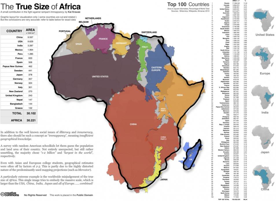
Relative size of Africa

Fascinating map! I’m really surprised that the area of Africa is really greater than all the regions listed – can that really be right? Maybe it depends what you count as being in Europe. On a minor point of information – while we’re battling immappancy – the outline shape representing the UK is slightly controversial 😉
LikeLike
Congratulations on getting the proposal completed. Best of luck in packing. Safe travels. Love! Mom
PS Great map.
LikeLike