A very interesting map by “Bold & Noble” that was posted on the Only in Ireland Facebook page.

Dublin neighborhoods. (Downloaded from Only in Ireland‘s Facebook page.)
A very interesting map by “Bold & Noble” that was posted on the Only in Ireland Facebook page.
Dublin neighborhoods. (Downloaded from Only in Ireland‘s Facebook page.)
Maps from yesterday and today:

This morning we’re also celebrating 19,000 visits to Ireland by Chance. Thanks South Korea, Pakistan, and India for waking up earlier than everyone else (due to the earth’s rotation) and checking the blog. 🙂
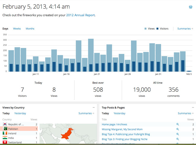
19,000 visits to the blog
Screen Shot 2013-02-04 at 10.34.33 PM
Yesterday’s geography lesson was a hit, so let’s see what we can learn from today’s visitors. It’s hardest if you cover the map above and try to picture each country on the list. For a much easier exercise, try to match each country name with its location on the map. Some of the answers are shown below.


Most recent map for today.
Sitting at home, working on the computer, and listening to nearby church bells ring. Meanwhile my mom sent an email that mentioned:
Had to look up one of the countries on the list! Everyone’s getting a geography lesson!
I decided a geography lesson wasn’t a bad idea.
I’ve included maps of the places most Americans probably can’t find on an unlabeled map. I realize that the names of several of these countries have changed in the lifetimes of both my mom and me. We learned different names when we were in school — so now is a great time to brush up!
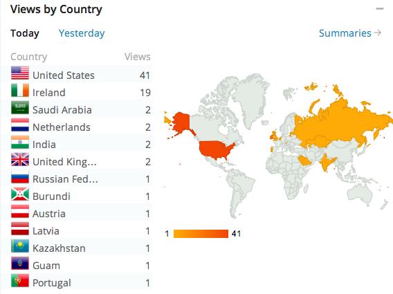
I’d had to look up Burundi myself this morning. It boarders Tanzania (where I’ve been twice!?!). It’s to the northwest of TZ. It’s just below Rwanda and is very small.


Exciting additions for today.
Cool! I awoke this morning to find two new countries added to my WordPress visitors map: Burundi and Kazakstan.
Look at the size of Kazakstan–it covers a huge area.
Welcoming my first visitor from Sri Lanka today! The holes in the WordPress map for my blog are starting to fill in. I was happy to add Peru and a number of countries in Africa recently. I hope you all will want to keep coming back to read my Fulbright stories….

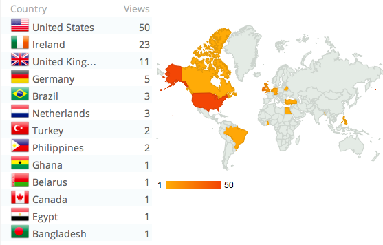
Screen Shot 2013-02-02 at 4.05.40 PM

Aris Venetikidis’ dream for Dublin transport. (Image downloaded from The Atlantic Cities.)
For an architect/urban theorist/planner like myself, Dublin’s transportation system seems to defy logic. I lack the adjectives to describe it.
But Eric Jaffe depicted the situation effectively in his October 2012 article in The Atlantic Cities.
His piece, titled “The ‘Confusing and Nonsensical Grandeur’ of Dublin Transport,” highlighted solutions posed by Aris Venetikidis, a skilled and clairvoyant graphic designer.
Apparently when Venetikidis arrived in Dublin, he was as perplexed as my sister and I about the lack of a comprehensive transportation network map. It’s a guide we look to in other cities when we want to travel around. We consider it essential.
Venetikidis let this frustration blossom into beauty. Like Colin Broderick, he too created a map of existing routes.
And then Venetikidis took this work a step farther. He researched the history of past proposals. And he designed several new maps. They illustrate how various moves could improve transportation by making the network more coherent.
Jaffe’s article on the topic is worth a read… I thank Fulbrighter Amanda Burnhard for send it my way!

Views so far today, November 30.
These little maps just blow my mind. Can you believe that people in Lithuania, Hong Kong, and Holland visited this blog in the past two days? And how did I get 32 visits from the UK today?
The Internet is amazing. I hope I’ve passed on a bit of knowledge, inspiration, and cultural understanding.

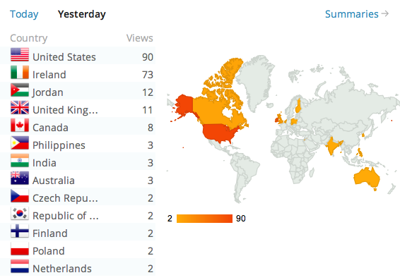
Views from yesterday, November 29.
